General Items sells objects that bring joy through utility. It had a logo and nothing else: no visual language for the web, and a homepage like any other small store. The hero had to say what kind of shop this is before anyone scrolls, and be worth describing to someone afterwards. I was responsible for the illustration and motion graphics, with art direction support from Koyal Raheja.
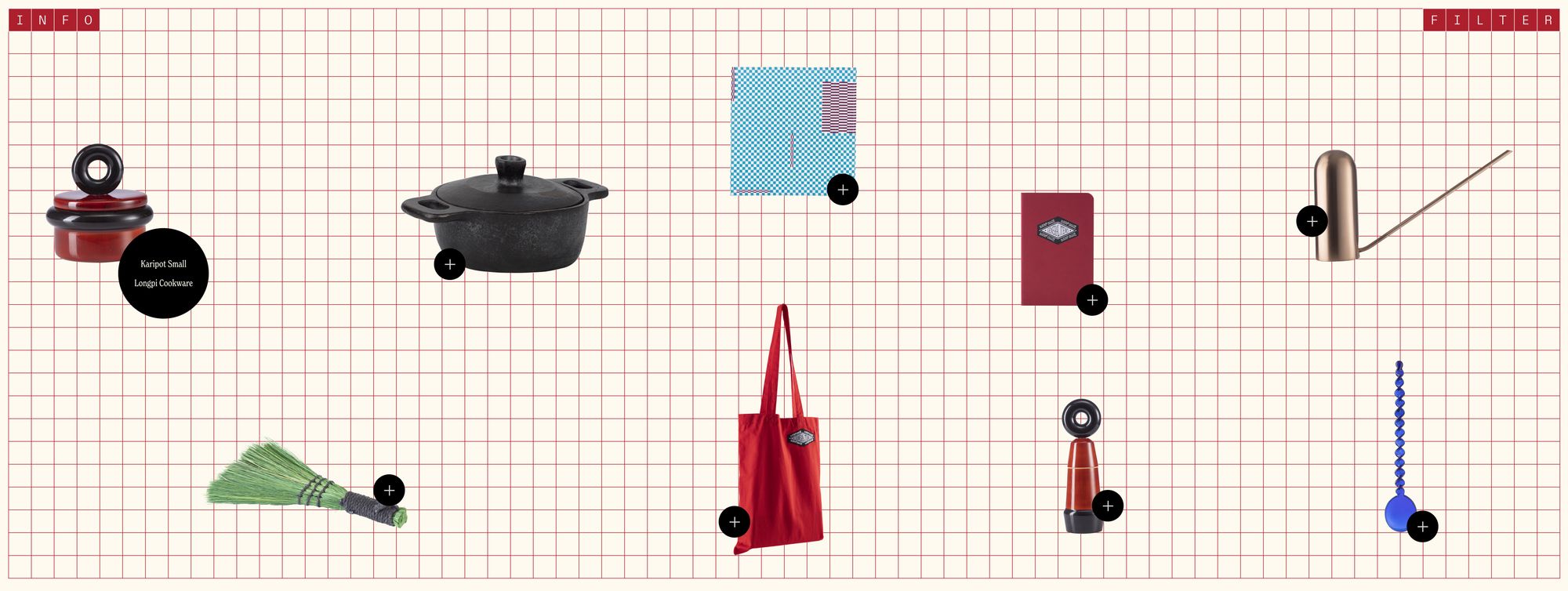
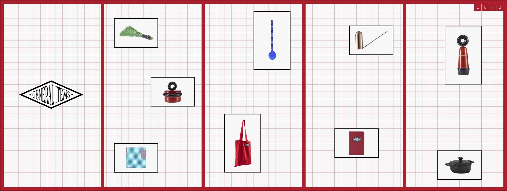
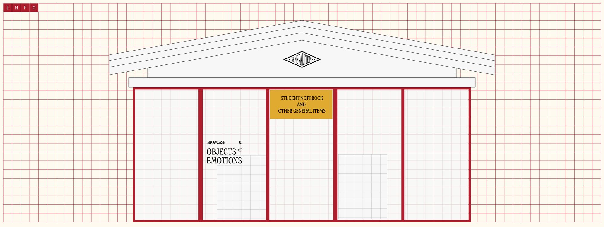
Two directions came first. Photographed products on a graph-paper grid: it needed every new product shot to one standard, and looked like every other good shop. The shop drawn literally, facade and windows: too literal, static, redrawn each time the catalogue changed. Neither survived, but the letter-grid drawn for one of them became the MENU and INFO panels.
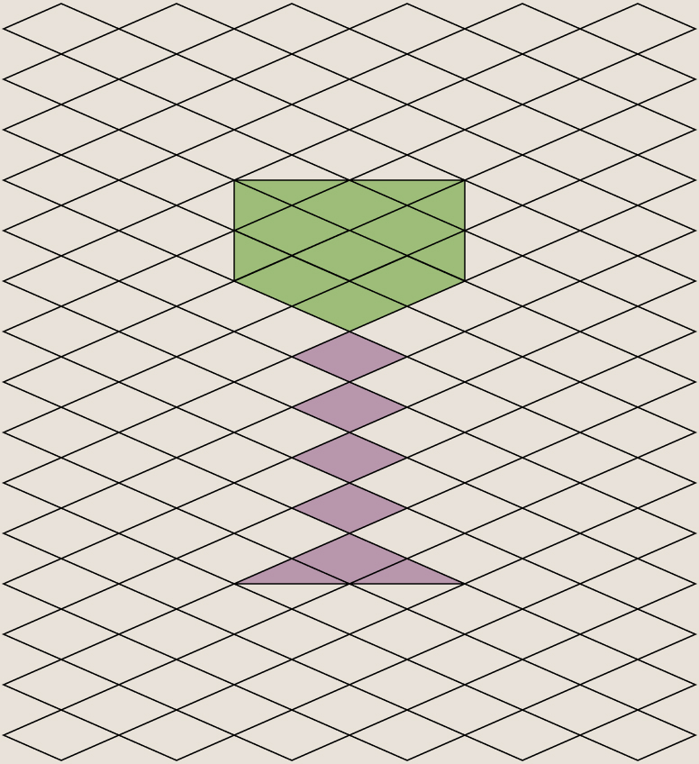
Rather than invent a style, I grew everything from the one asset the brand had. The logo’s diamond is the unit: tile it for the ground plane, stack it for an object. Nine objects, one per product family, share that grid, one light direction and a cream ground with accents of red, blue and green, so nine different forms still read as one family.

Each object loops on its own rhythm, a bounce or a spin or a settle, tuned so nothing moves in lockstep. Nine loops on one homepage is a weight problem before it is a design one, and that shaped the animation: short cycles, invisible seams, and a decision about what needs to move on load.
The hero is atmosphere, so navigation had to be unmistakable. MENU and INFO drop a full-screen red panel over the world: categories as a monospaced letter-grid, the craft story opposite. Full-bleed rather than a dropdown, because a small catalogue reads as more considered given the whole screen, and closing it returns you exactly where you were.
Most of the real work was the handoff: loops that cycle invisibly, deciding what loads when so nine files can share a page, and a spec of grid positions and timing offsets a developer could build from without me. The hero is live, and the system outgrew it. The diamond now runs across packaging, social and the shop itself, extended by the team.