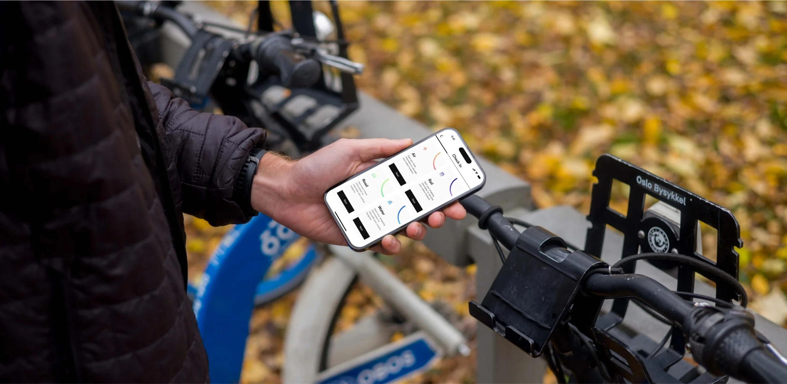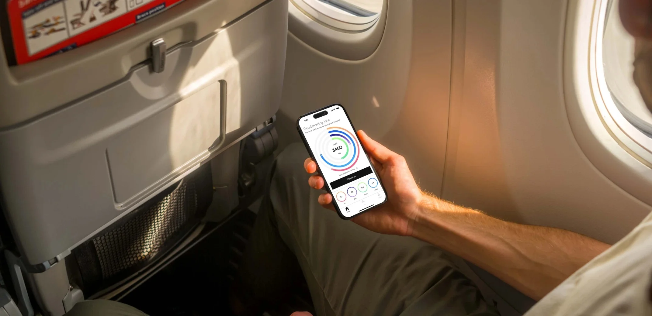
Environmentally conscious individuals often struggle to calculate and offset their carbon footprint due to the lack of simple, accessible tools. We set out to address this gap by creating Carbon, a user-friendly mobile app that simplifies carbon emission tracking and connects users to verified green projects for impactful offsetting.
Goal
Through a structured and iterative design process, including user interviews, wireframing, prototyping, usability testing, and accessibility considerations, we transformed complex environmental data into clear, actionable insights tailored for everyday users.
What I accomplished
User Research
I conducted thorough interviews and developed empathy maps to delve deep into the users I'm designing for and understand their unique needs. Our research led us to identify a pivotal user group: individuals who frequently travel for business purposes.
Need for easy carbon footprint calculation
Desire to offset carbon footprint
Need to address environmental impact
Wants to minimise carbon footprint
Competitive Analysis
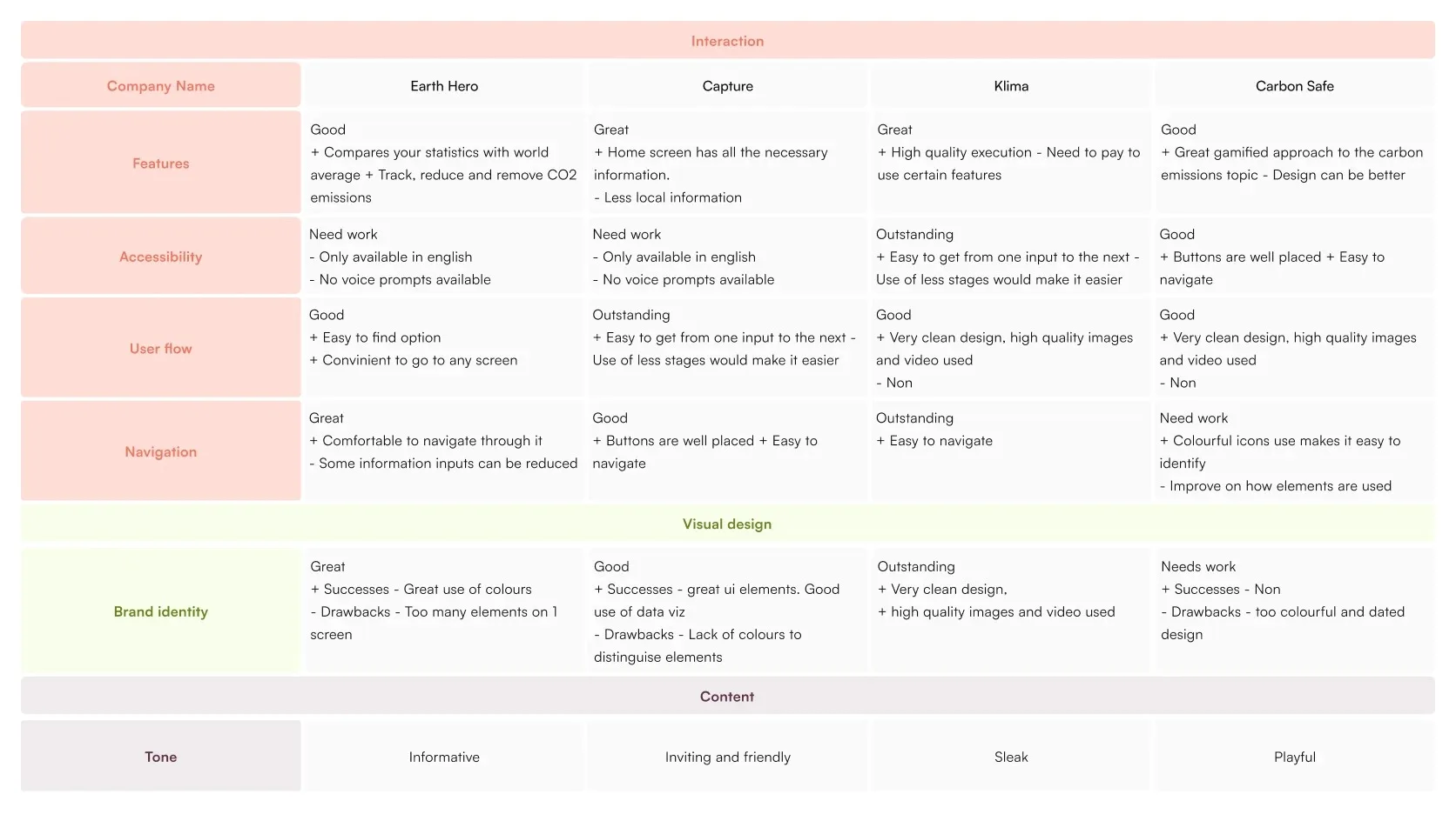
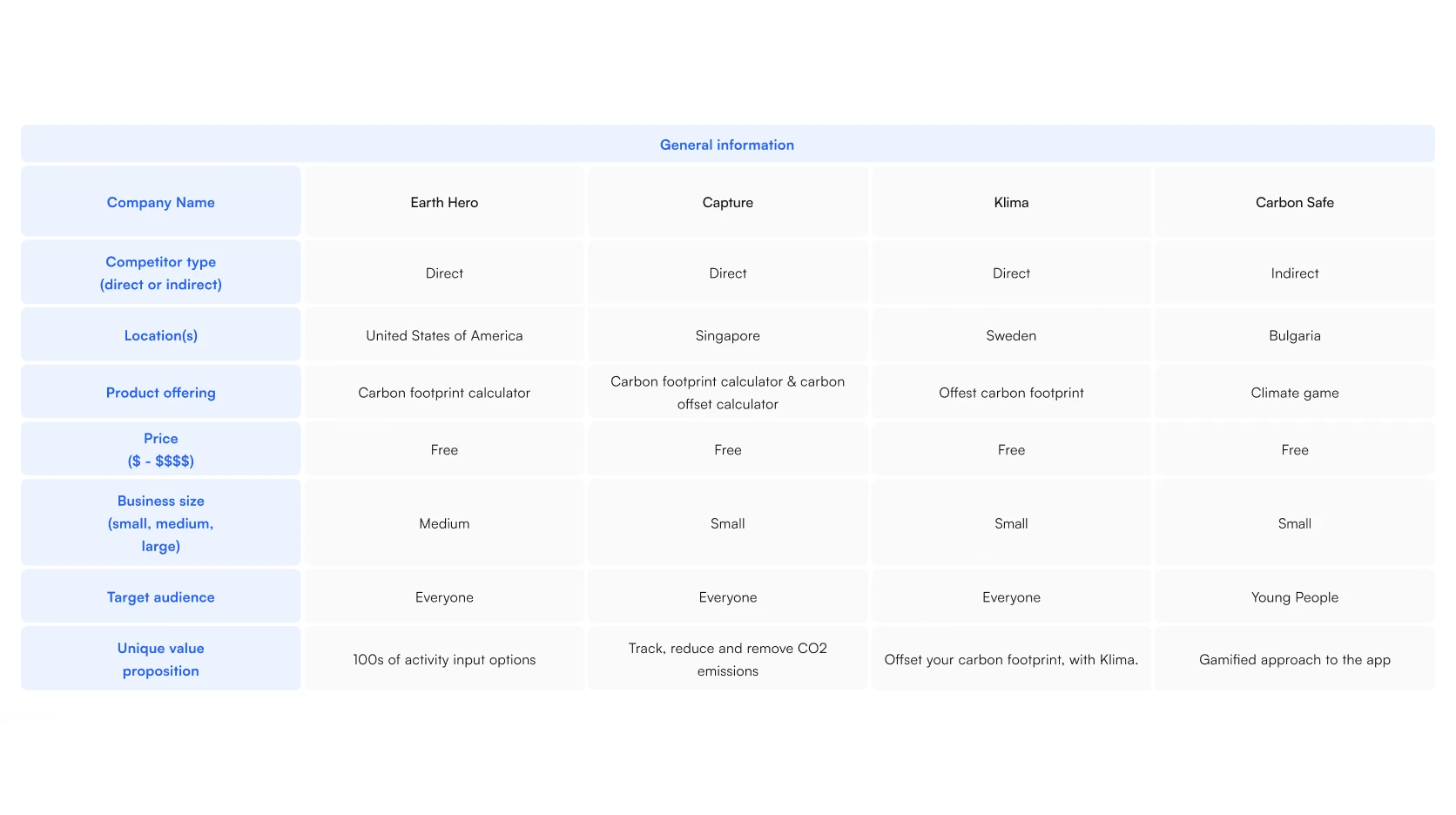
Conducting a competitive analysis provided valuable insights into the existing market landscape. This, in turn, helps us identify opportunities for enhancing our product by focusing on underserved features that can set it apart.
User Persona
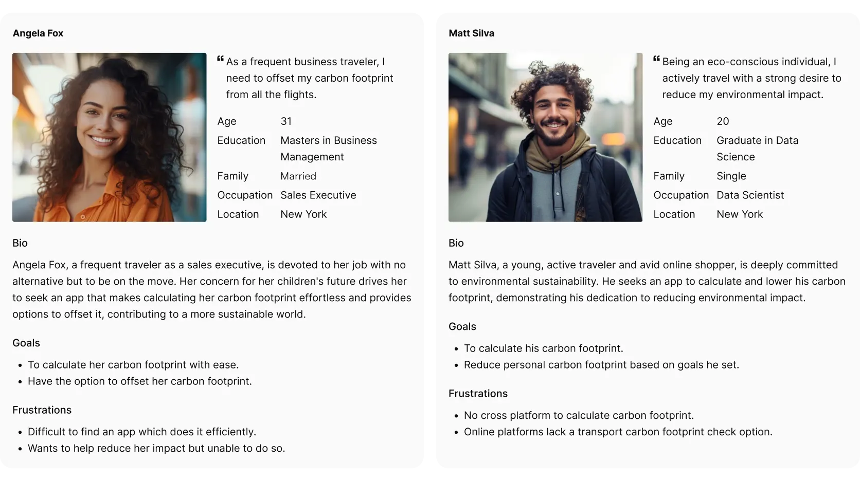
Crafted two user personas that encapsulated the most prevalent use cases. Drawing from surveys and interviews, I meticulously outlined their characteristics, objectives, and pain points.
User Journey Map
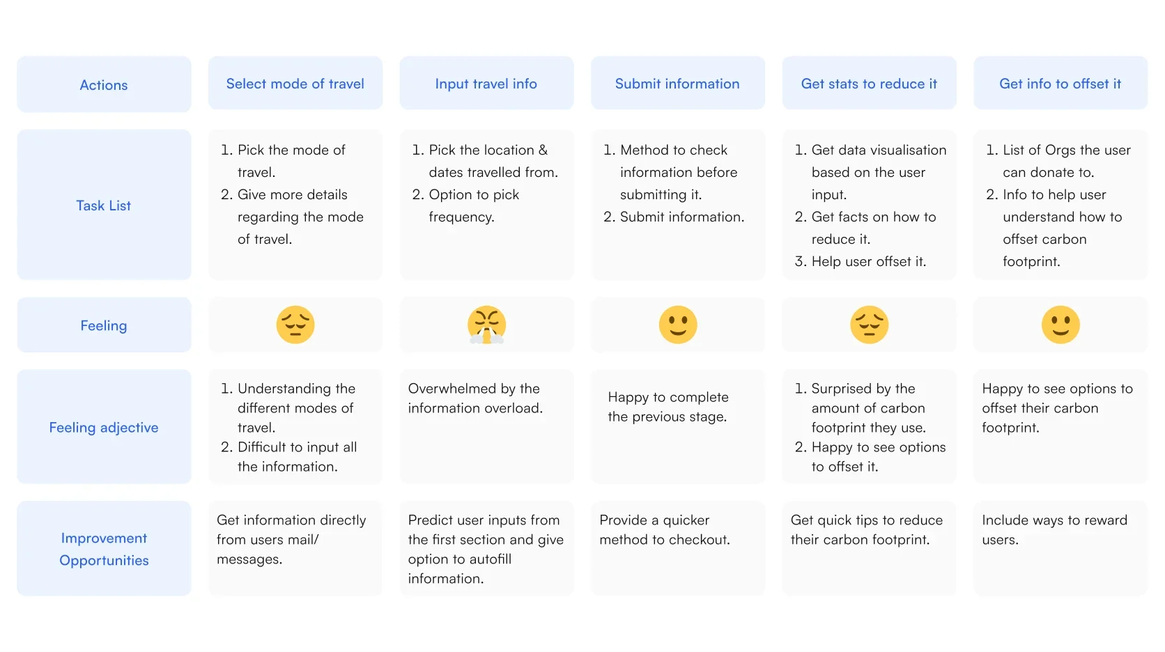
Gain insights into Angela Fox's carbon footprint generated from her frequent travels and guide her in effectively offsetting it.
User Flow
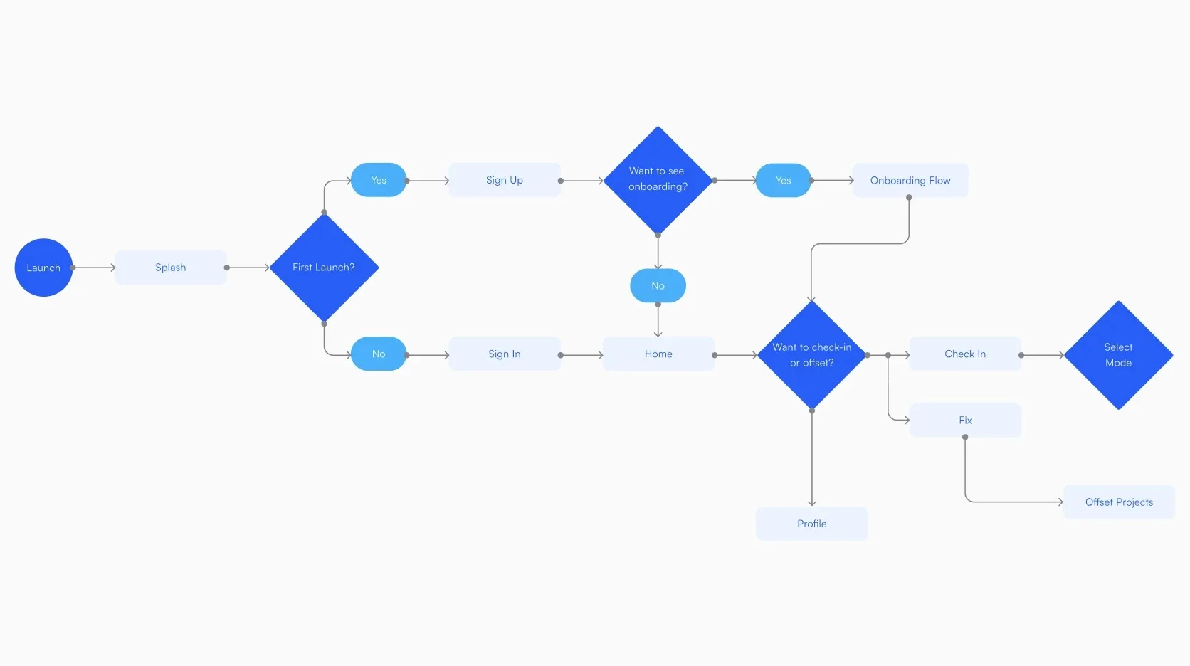
I developed a user flow to comprehensively map the user's journey within the app. My goal was to optimise their navigation through the app's primary features, ensuring a seamless experience while making all the information easily understandable.
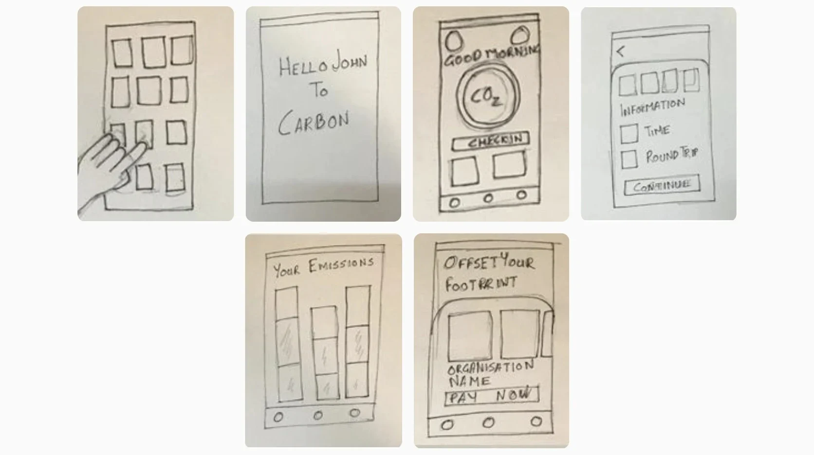
Paper wireframes
Carefully sketching multiple iterations of each app screen on paper was essential in ensuring that the elements eventually translated to digital wireframes effectively addressed user pain points. For the home screen, I emphasised placing the user's emissions prominently at the centre, complemented by a convenient check-in button.
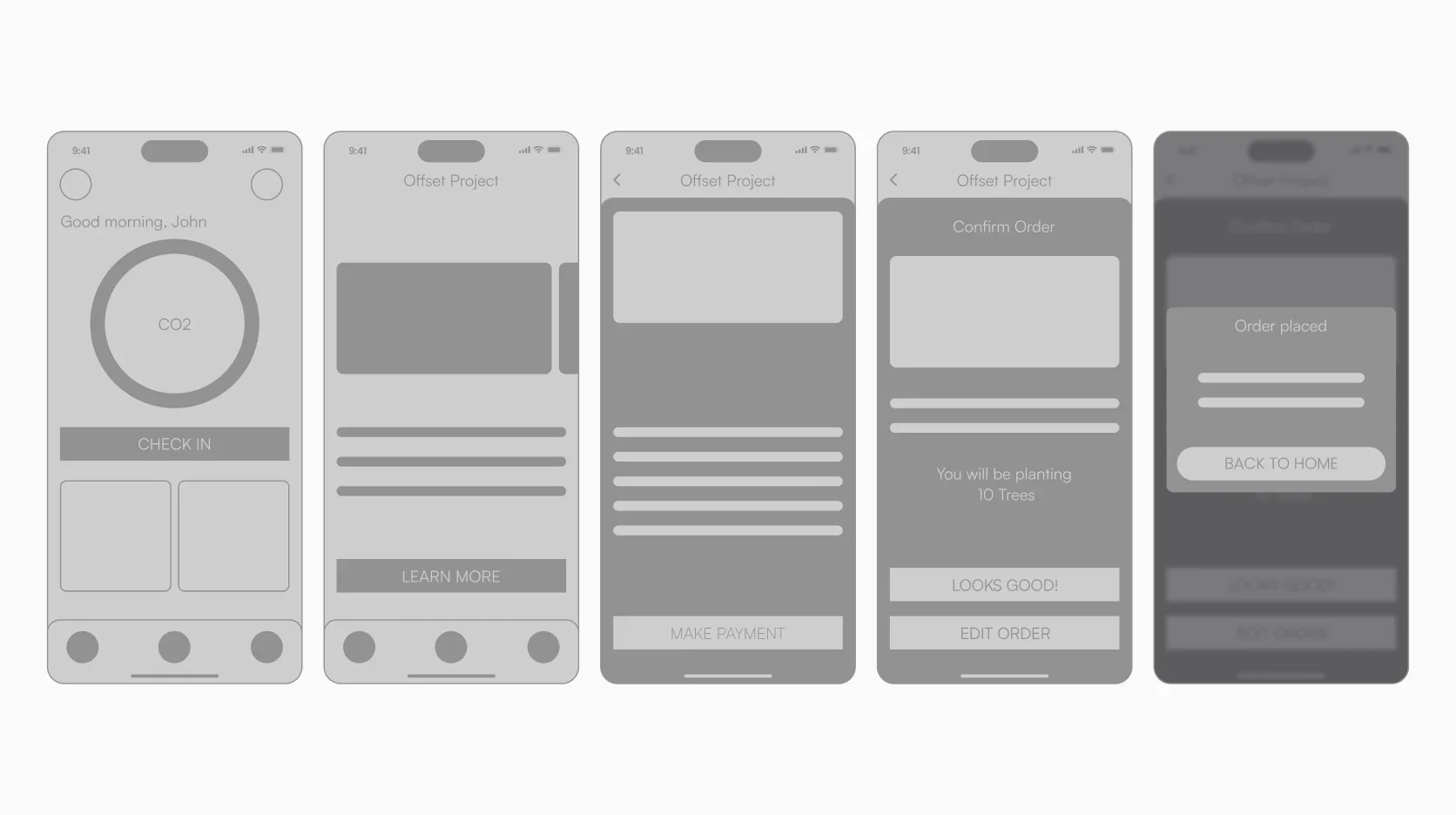
Wireframes
The initial concept established a general layout for the app. However, as the digital wireframe design progressed, the layout naturally evolved, introducing more engaging elements.
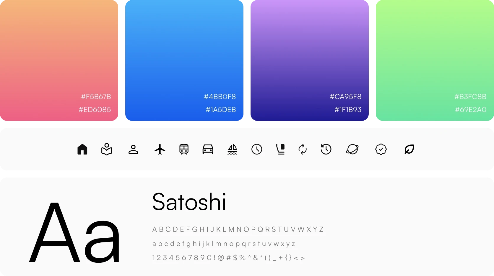
Style Guides
Usability study: findings
I transformed the set of digital wireframes into a low-fidelity prototype. This prototype interconnects the primary user flow, facilitating its use in usability testing. The findings and feedback from users are detailed below.
- The home screen was perceived as overwhelming by participants.
- Participants reported the offset carousel page as user-friendly and intuitive.
- Participants successfully navigated through the check-in screen.
- Participants highly appreciated the data visualisation for its utility.
- Participants encountered challenges with the input method, finding it difficult to use.
- Participants successfully located and utilised the check-in button on their first attempt.
Design improvements based on usability study
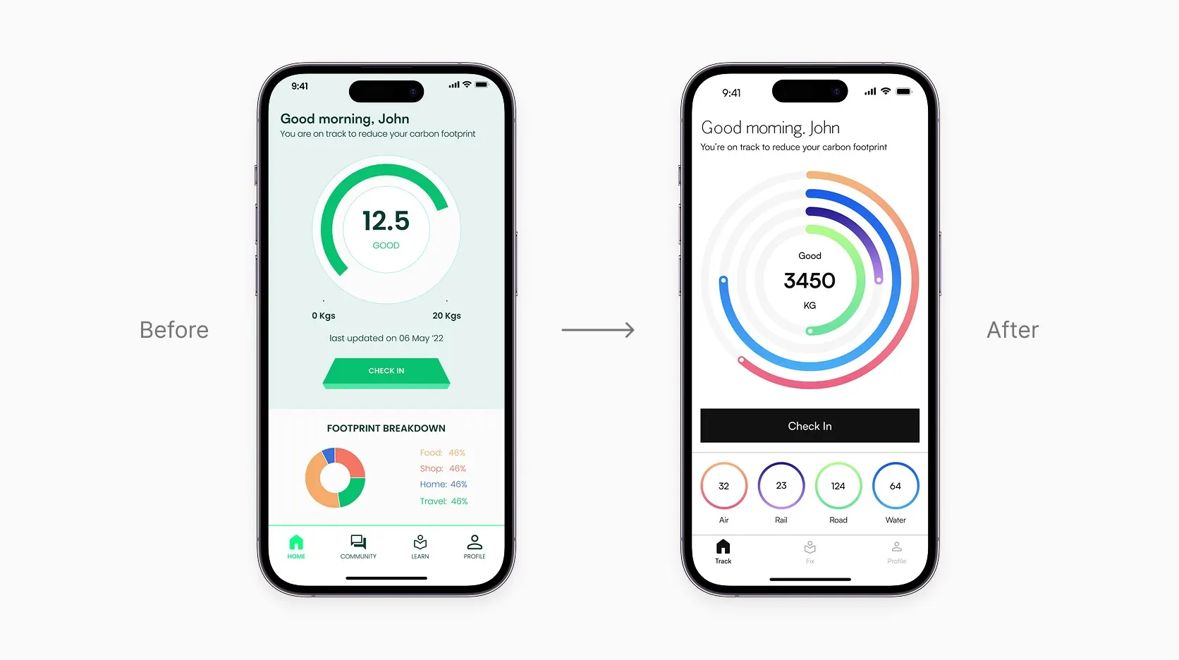
While designing the mock, I started evolving the design. I understood the features better which helped me improve the design and make the colours and layout more consistent.
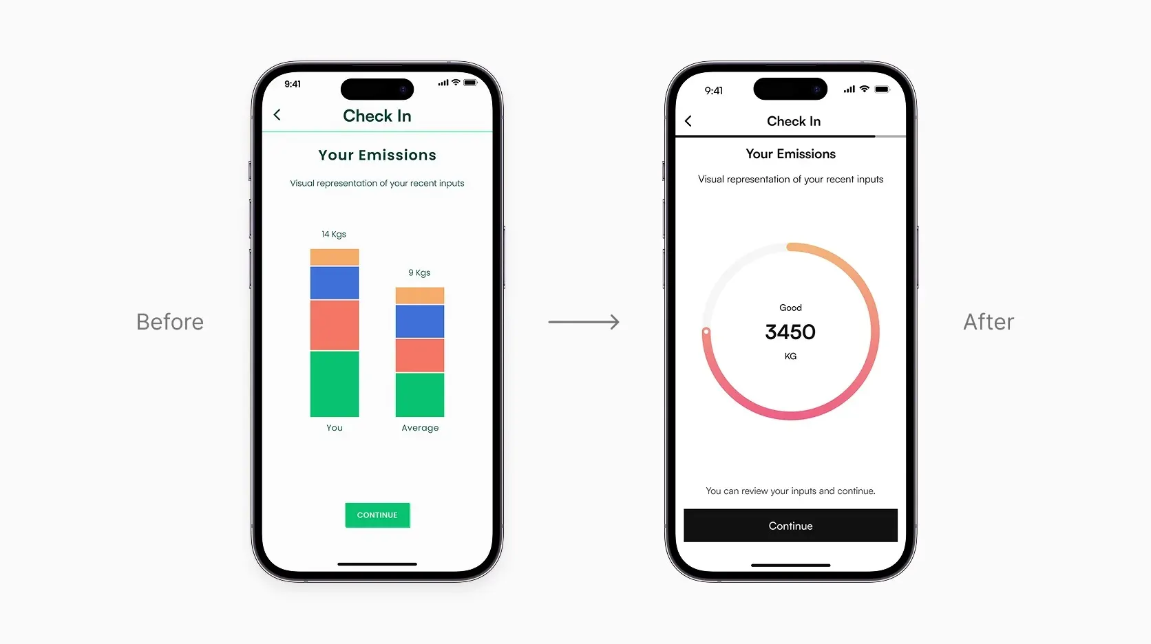
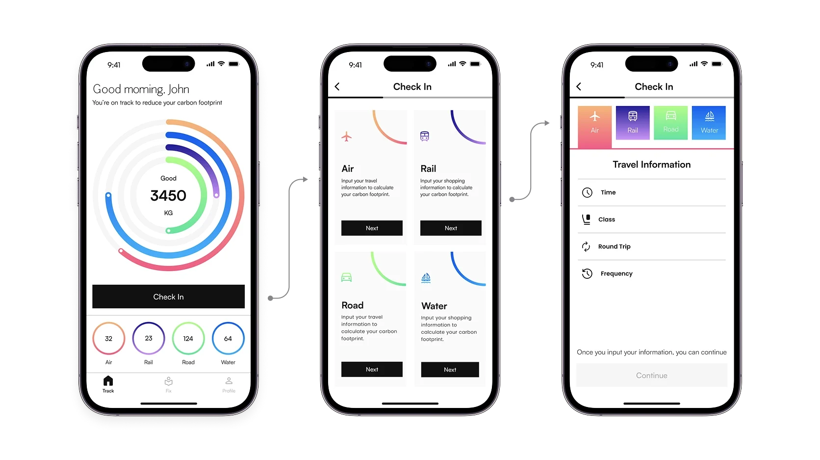
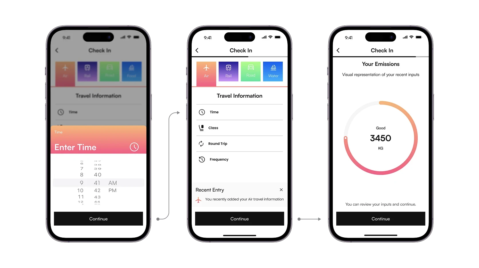
Inputting carbon data
When crafting the main flow, my primary goal was to ensure simplicity. On the home screen, I placed the user's emissions front and centre, accompanied by a check-in button. This streamlined entry into the flow, allowing users to navigate it effortlessly.
Offset Flow
After users grasped their carbon footprint for a specific duration, they had the choice to take action and offset it. This involved selecting from a range of available projects they could support.
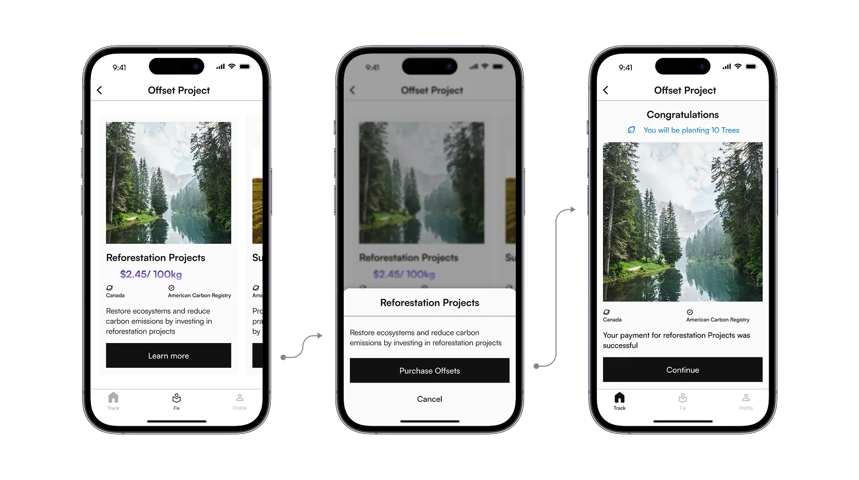
- Employing visual aids such as graphs and colour schemes to enhance element clarity and comprehension.
- Implementing a user-friendly bottom navigation system for swift access to any page.
- Utilizing imagery and intuitive icons to facilitate effortless navigation.
- Incorporating a dark mode option to enhance accessibility and user comfort in varying lighting conditions.
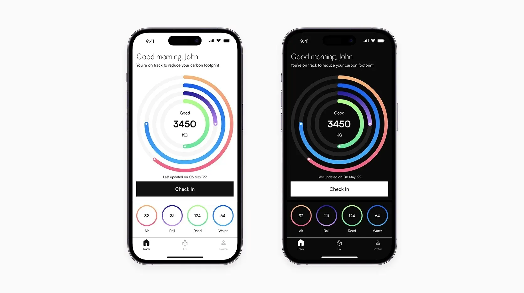
Turned complex carbon data into a simple, actionable experience.
Designed habit-led actions that boosted user motivation.
Built a modular, accessible design system for scalability.
Made the app feel friendlier and more intuitive through improved onboarding.
My first app design journey, which involved adhering to the comprehensive UX process, was a significant learning experience. Gaining insights into peer reviews, usability studies, and the transition from low-fidelity to high-fidelity prototypes were particularly enlightening for me.